Homenow.io
For many tenants and landlords, their relationship is nothing more than paperwork—two strangers bound by a contract, with as little interaction as possible.
Homenow.io is an online property management portal that exists to help mitigate the relationship and distance between lessors and lessees. Contract-related content such as household duties, safety checks, and documents lives within this digital resource. Upon agreement, the manager shares an access link and they are connected via the portal.
But the product was originally designed for the property manager’s view of the portal, not the renters. Homenow.io noticed a steady drop in renter engagement and a loss of contact with their landlords.
The Ask: Create a mobile design that tenants will actually use

Case Study Contents
Journey Map / Thought Map / Wireframes / User Testing / Prototype / Results

Team
Designers: Alan Clark (UI lead), Carlos Shows (researcher lead)
Design Planner: Ian Michal Smith (me)
Stakeholders: Levi Bernsrd (product designer), Tao Luo (director)
The project took three weeks: July 2021 - August 2021
My Role
I handled scrums, aligned daily priorities, assigned tasks, and created our design artifacts in InDesign. I helped where needed in research and UI.
Journey Map
Where are these pain points?

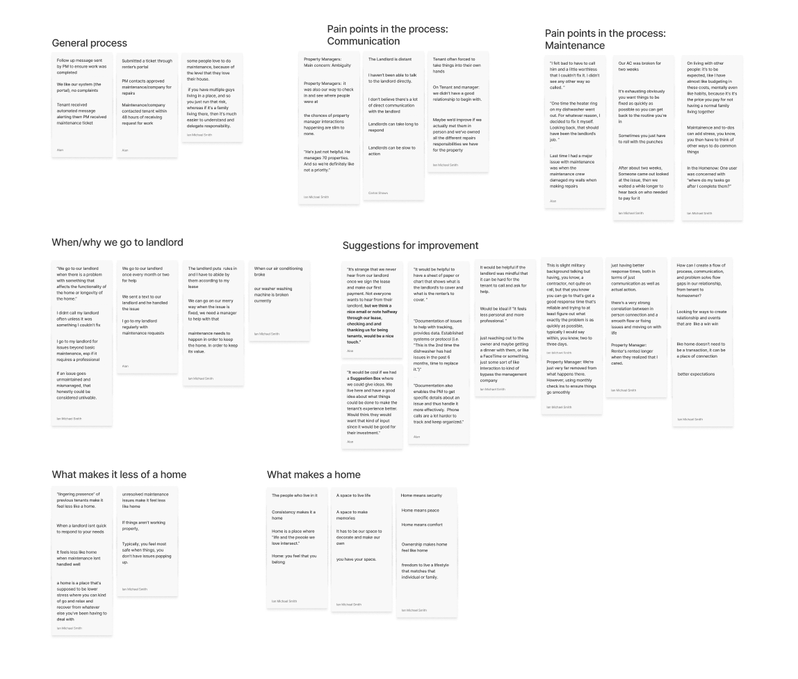
How: As a team, we discussed our assumptions about the tenant/landlord relationship. We then compiled quotes from our interviews into one place with the responsibilities of our user renters in mind.
What we learned: Our stakeholders expected the tenants to handle two major responsibilities:
Stay connected in regards to lease requirements (housekeeping)
Complete tasks through the app
Creating this Artifact: We transformed our quotes into a journey map and shared them with both stakeholders.
Note: This kept all stakeholders invested in the project from the beginning. It also prevented scope-creep later in the project. We chose only to focus on the first problem statement and grouped all features related to the second for after the product was launched.
Two Problem Statements
Client Problem Statement: Homenow needs fresh insights and research on their existing user touchpoints in order to increase overall user engagement.
Homenow.io Problem Statement: Renters need a digital resource to stay on top of long-term repairs to mitigate issues and increase personal comfort.
The Solution
Tenants need a tool that not only improves communication with their landlord, but empowers them to stay on top of maintenance in order to improve the quality of their home and avoid costly issues down the road.
Thought Map
What makes a home?

After each session, we held a debrief session with our stakeholders to discuss key takeaways, pain points, and surprises. This helps the team reflect on the session and starts building us up to the larger synthesis. We synthesized research sessions transcribing them directly into an excel spreadsheet and together we took opportunities to look for common pain points, needs, and goals amongst our data.
As a team, we did affinity mapping of the most common trends. Since we were very focused on pain points for this study, we also took into account any other needs or users had or other methods participants were using.
Initial Assumptions
Tenants aren’t motivated to maintain a home they don’t own
We needed to tap into something else to motivate tenants
Note: We thought one answer to this might be a method of gamification, and we entertained this all the way up to our initial wireframes.
Wireframes
What visuals will help the user engage?

However, we pivoted off the initial gamification concept once we referenced our research. In our case, gamification alone wouldn’t solve our renters’ user engagement issue. We discussed the idea further with our stakeholders, and ended up saving these features for post-release.

Design Decisions
We chose vibrant color palette, relaxing to the eyes to increase enjoyment
We added a gradient to the logo and background for personality and depth
We built the bottom navigation to meet both business and user needs/goals
We considered for future developers and designers to use our designs, and connected with Homenow.io’s product designer to ensure it fit their needs.
User Testing

Is the page navigation clear to new users? Are the tappable areas and meanings of icons intuitive? Can this design integrate with the existing portal app on the property manager side?
Our researcher moderated six testing sessions via Zoom with regional managers and renters who have never used Homenow.io’s products.
In the end, we designed a mobile-oriented product that is…
Simple to navigate
Pleasing to look at
Help tenants stay on top of maintenance
Serve as a hub for most tenant’s needs
Prototype
Results
The app piloted regionally in September 2021, and rolled out to Homenow.io’s entire user base in January 2022. Tracking closely with product leadership and the data analyst, we used Google’s Heart framework to measure success.
Happiness: Did our users indicate that they were more satisfied with their performance, as measured via survey before and after launch?
Engagement: How long did the tenant spend on each page? Did they open the app several times throughout the day?
Adoption: Which features did they use most? Which were ignored?
Retention: Did the manager continue using the older desktop portal?
Task Success: Did they nail down to the detail pages?
We are in the process of gathering this data to apply to future versions of Homenow.io.
Contact ME
I’m currently taking on new clients. Please include as much information as possible about the scope, timeline, and budget of your project so we can discuss your needs effectively.
